All designers wish to be up to date with the latest trends in the field they are keen on. Especially, web design is so dynamic, some trends are considered the fresh and modern couple of years ago but quickly be completely out of date. So, when the time for 2017 nearly ends, web designers need to know cutting-edge trends and evaluate the changes might happen to be 100% ready for a new year coming with the success.
This article will figure out 8 hottest web design trends that will shine your designs absolutely.
#1. Photo Content
There is nothing to say if not mentioning to Photographs in your design. And designers need to create unique pictures and photos in your e-commerce site designs. A study has shown that more than 60% of users pay their attention to the design that contains relevant and unique photos, and pictures.Hence, you must focus on photo content with informative, quality and unique photos and pictures to give user maximum attention.
#2. Bright Colors
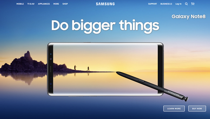
Yup! Let’s shine your design by using bright colors. Users are looking forward to the design that employs bright color schemes. Large, bold graphics, patterns and gradients are taking over web pages, again replacing more traditional design elements.
Nonetheless, you need to carefully consider before choosing the bright color into your design. Whether it suitable for your firm’s personality or not, whether customers love this color style or not because bright colors can be a challenge for users.
#3. Scalable Vector Graphics (SVGs)
You will see a booming of SVGs that overtakes more traditional file formats such as PNG, GIF, and JPG. So what are SVGs? They are vector images, not pixels that creating lots of advantages for users such as maintaining the quality and not requiring any HTTP requests. Plus, SVGs are necessary for new multimedia experiences in 2018 including 360 degree-views, 3D images, and Cinemographs.
#4. Cinemagraphs
And Cinemagraph is a special thing I want to mention here, guys!
Your design must update the hottest web design trend in 2018 with using Cinemagraphs that is a perfect combination of a static image and a full-blown video. Does that mean the site will get a lazy loading with these images like a video? Absolutely No. They are quick snippets to create dynamic images that are different video and not influencing your site loading. For a real illustration, you can see the magic of moving photographs in Harry Potter. Enjoy more about Cinemagraphs at http://cinemagraphs.com/.
#5. Animation
Let’s make your design become dramatic and attractive with a flexible animation usage. Finding animated objects in everywhere as logos, icons, sites, applications, transitions and more and the animation you can use might be video, gif, or even Cinemagraphs. By using the animation, your site will attract more and more customers and stay on the site for a long time.
#6. Ways to Convert: Call to Action
The way to convert or call-to-action that motivates visitors to actions. Both seamless and simple call-to-action are effective in your 2018 web design. Stunningly, attractive headlines and compelling graphics will decide the action of a visitor. You also use arrows, quotes, banner, and top. Bottom sticky to create the content you wish to highlight as well as the action you want visitor makes.
#7. Minimalism
Minimalism comes in the popularity of the web design trend 2017 and now it continues the path.
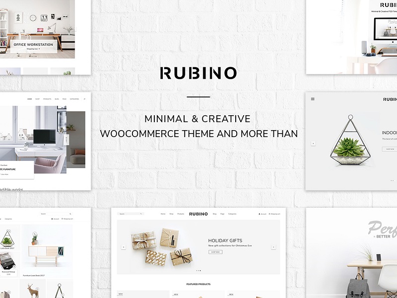
The reason for this trend is users’ patience. You easily lose your customer if the site loading time over 4 seconds. And 2 seconds is the perfect loading time for your site. To reach this target, designers must reduce the number of on-page elements and reduce the number of HTTP requests. And that is the main reason for the booming of minimal designs that is simply perfect. For an illustration, Rubino – a minimal design from YoloTheme is worth to visit.
#8. Open composition & Asymmetry
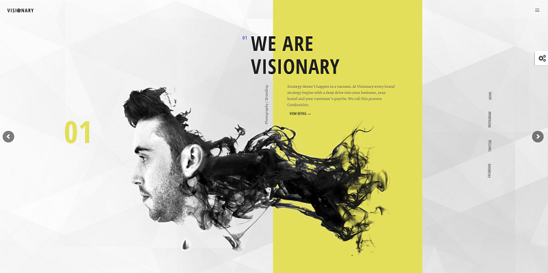
Last but not least, we call the 8th trend is a revolution for web design filed. Users are not looking forward a fit designs as in the past, they need the breakthrough in the web design. And open composition and Asymmetry website design breaks out of traditional column constraints. Now the elements in your pages might float or overlap each other. Instead of the concrete and symmetry structure as in the past, lots of websites employ open layout with using parallax scrolling, where different layers of the scroll at the different speed. You can visit Visionary – a creative agency theme to learn more about this trend.
Final thoughts
Web Designers should get 100% ready for what are new trends in 2018. They should get a good start by collecting and take a deep dive into these above trends. By the way, the best advice for you before using these new trends in your design:
– Choose the trend that fits your site’s personality
– Do it step by step
– Get ideas for these changes from customers
Hopefully, these up-to-date features can make your design shine and attract more and more customers. We are happy for any sharing about web design trends in 2018 in the comment section.



Comments are closed.